top of page
Home
Portfolio
Contact
Testimonials
About
Back
All projects
Previous
01
Royal Ballet
Royal Ballet: Impressionist Swan Lake Animation
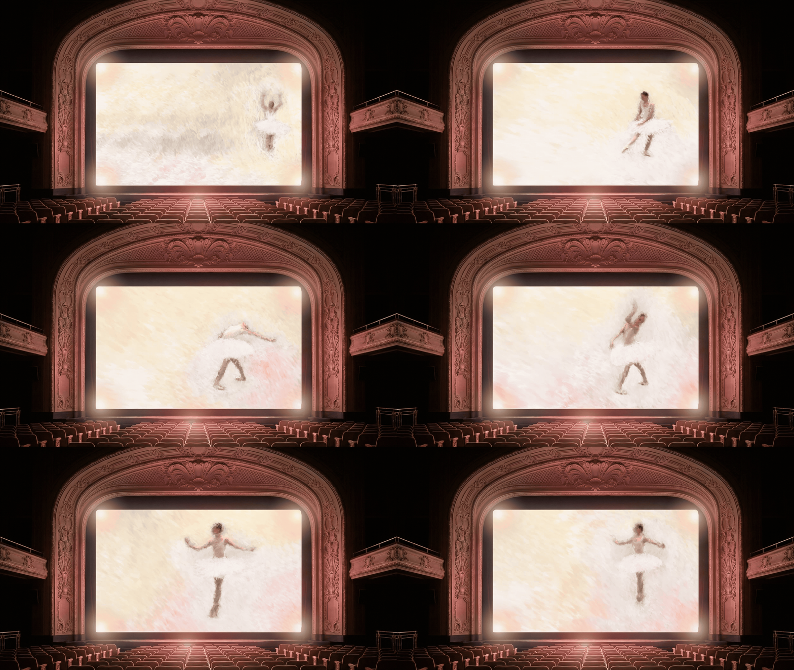
Animation and flip book artwork creation for the Royal Ballet
02
You Food Co.
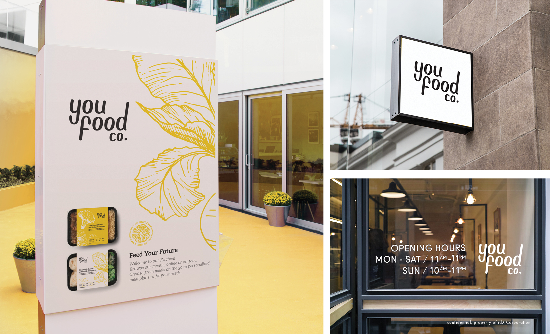
A successful meal prep company approached idX with plans to expand from its established online business into a network of physical retail stores. I was involved from the early strategic stages, researching the market, developing naming options and exploring creative routes to establish a new brand identity for the business.
The project grew into a complete brand and environmental design programme. I developed the visual identity and then translated it into the physical retail experience, considering how customers would move through and interact with the space. This included developing the store narrative, wayfinding and signage, alongside packaging, POS, marketing materials, posters, environmental graphics and bespoke illustration.
The result was a cohesive brand experience designed to work seamlessly across digital, physical and customer-facing touchpoints.
03
Jos. A. Bank Store Rollout
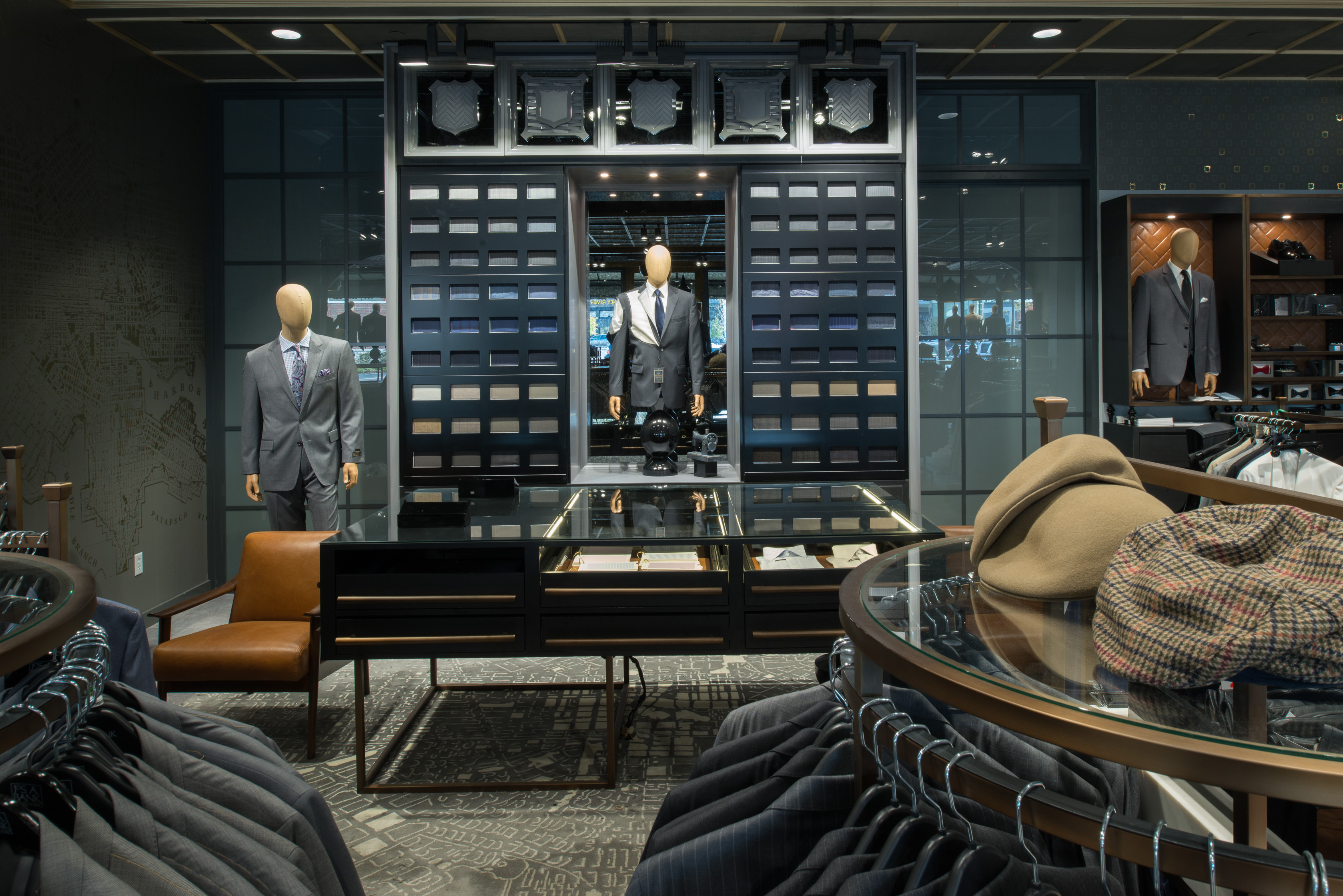
I designed a suite of bespoke wallcovering and rug designs for Jos. A. Bank, taking the project from pattern and map artwork through material research, production and installation. I project managed the complex printing process across three idX divisions, overseeing the development and delivery of the final materials for a rollout across more than 300 stores throughout the US. The project generated over $2 million in revenue for idX.
04
Pitch Decks for Global Clients
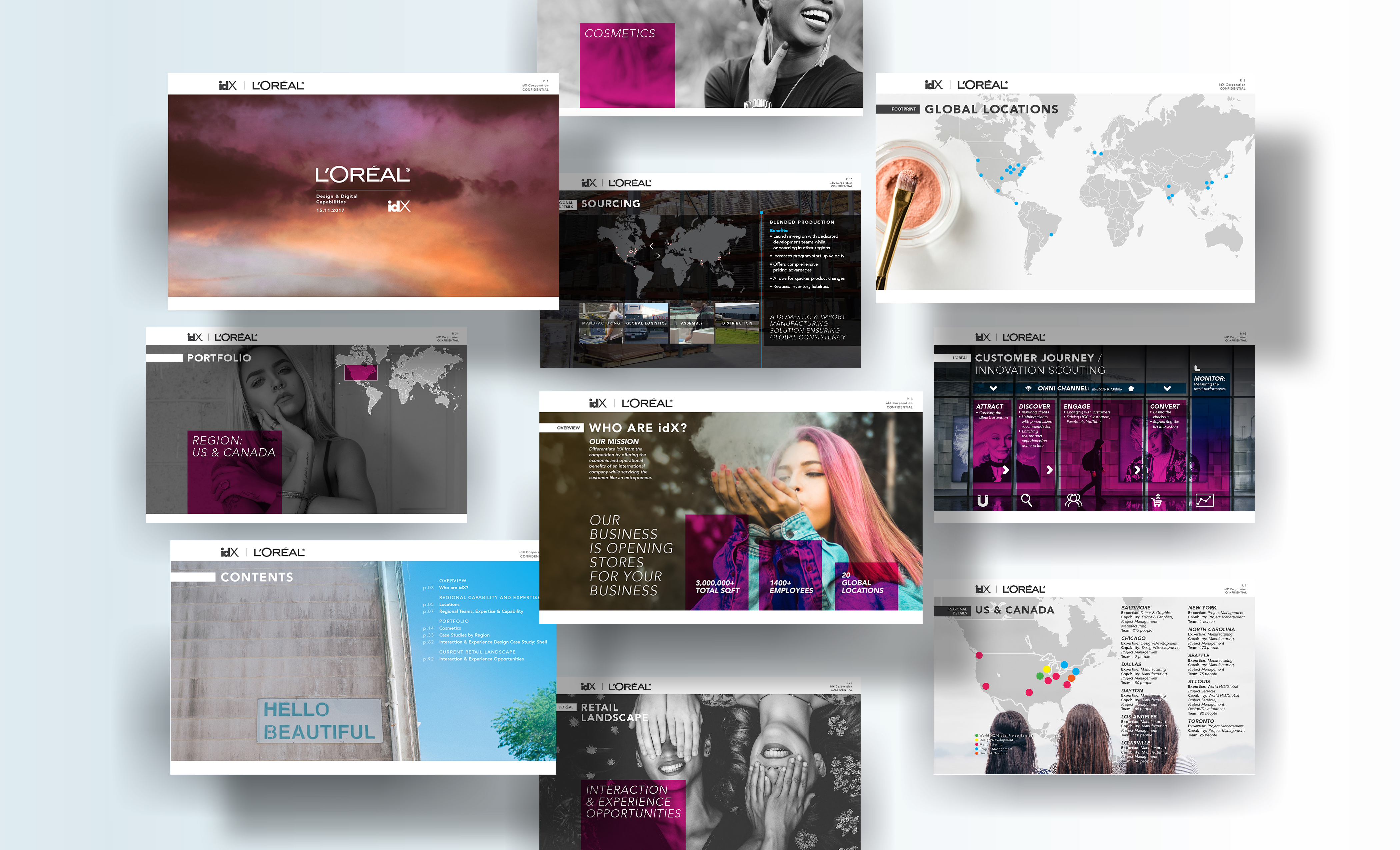
A selection of pitch decks created for global clients including L'Oréal, Shell, Samsung and Under Armour while at idX Corporation. I developed the storytelling, structure and visual design, creating compelling presentations that communicated idX's capabilities and brought proposed retail concepts to life.
05
AQLÜM Lighting
I developed the brand identity for AQLÜM Lighting from the ground up, including naming, logo design and the wider visual identity. I also designed a suite of brochures to showcase the company’s lighting products, creating a refined and cohesive brand presence across print and marketing materials.
06
Freda Gin
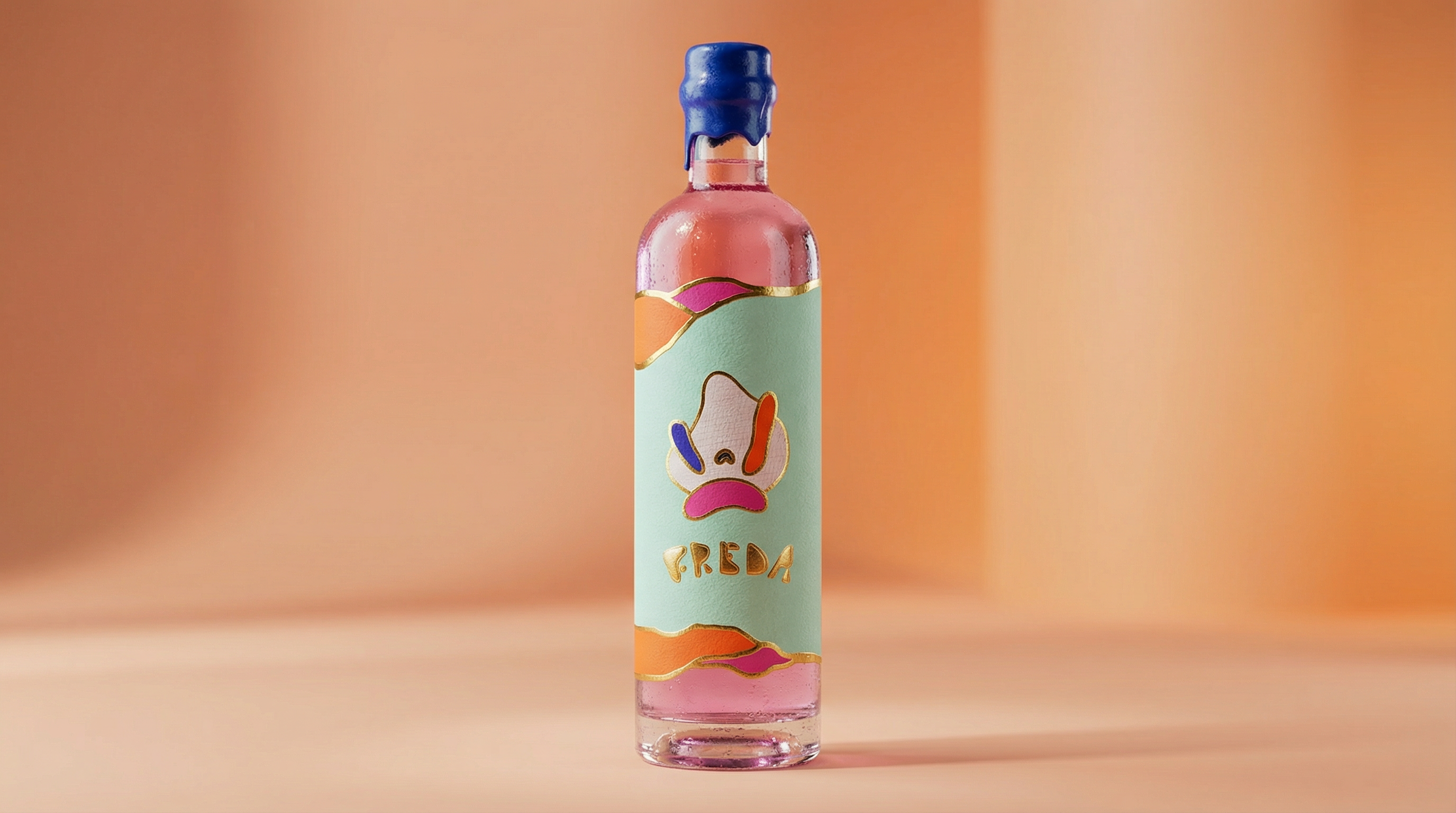
I created the brand identity and packaging for FREDA, developing a bold and playful visual language for this contemporary pink gin brand. The identity combines expressive typography, vibrant colour and distinctive graphic forms across the bottle, stationery and digital touchpoints, creating a cohesive and memorable brand presence.
07
Jameson
'That's Pretty Neat'
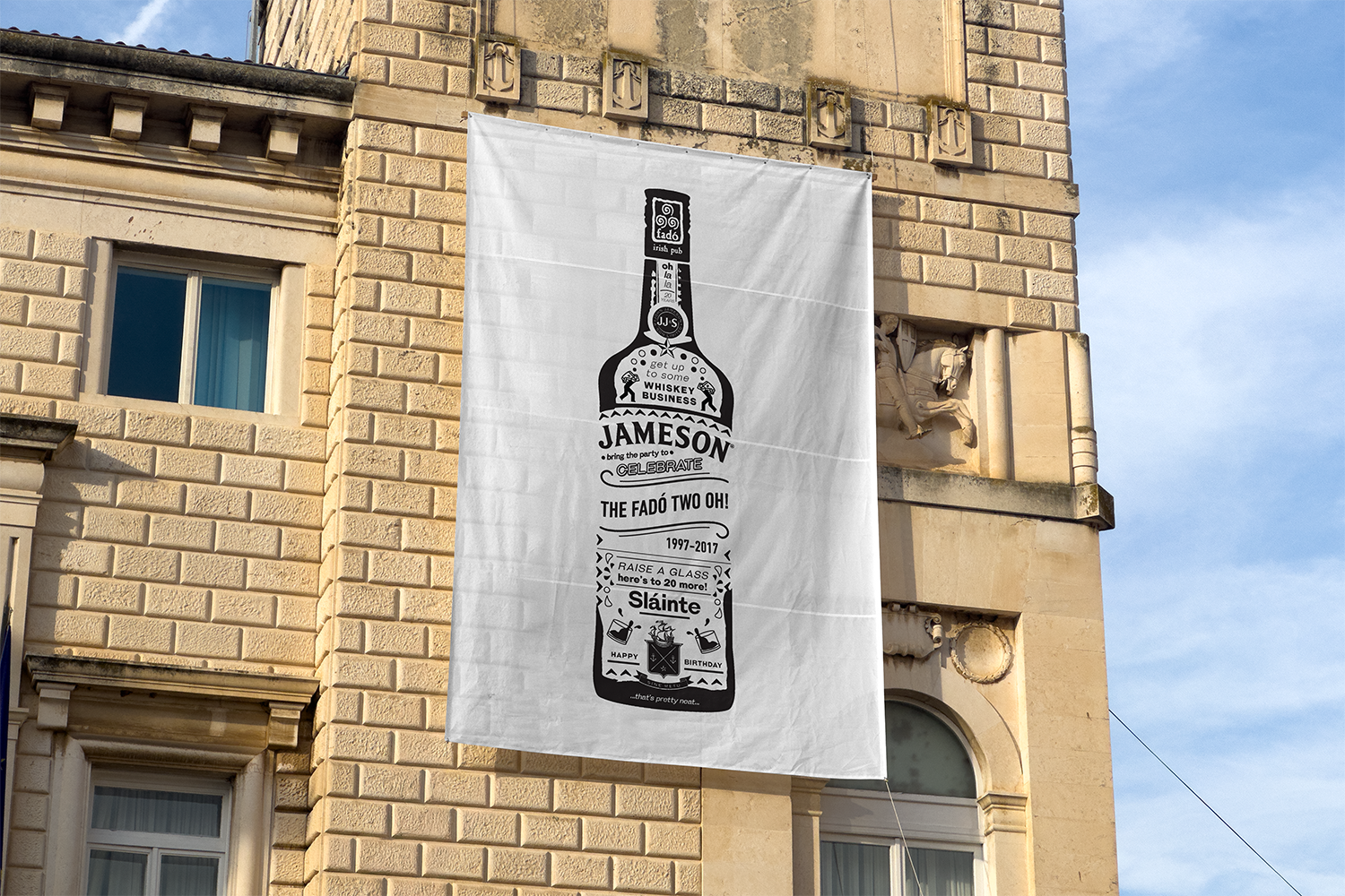
Commissioned by Jameson, I developed the creative concept, copy and artwork for promotional materials celebrating Fadó Irish Pub’s 20th anniversary. The illustrated design brought together Jameson and Fadó’s visual identities with playful, celebratory messaging, creating a distinctive piece for the anniversary campaign.
08
Museums by Icon
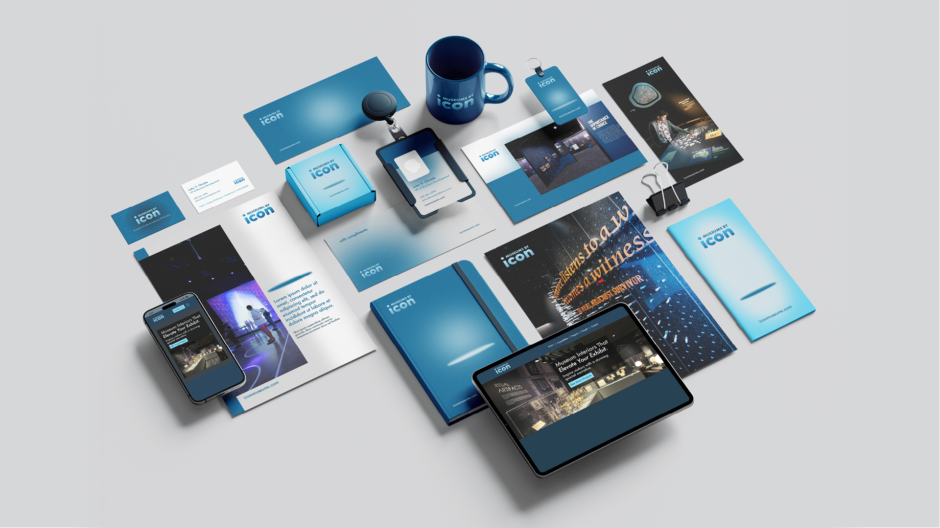
Following my work with Icon Design on their retail fixture design website and wider brand materials, I was approached to help shape a new venture focused specifically on museum and exhibition environment design. Through a series of consultancy workshops and strategic conversations, we defined the positioning and ultimately landed on the name Museums by Icon, a natural extension of the parent brand, with its own distinct presence.
Building on Icon’s existing logo, I was tasked with elevating and refining it to suit this new cultural and experiential space. From there, I developed a considered brand system, including colour palettes, typography and a suite of print and digital collateral that balanced heritage, refinement and impactful design. I also designed and built the website, creating a platform that showcases their specialist expertise with confidence. The result is a cohesive, elevated brand that has been extremely well received.
09
Making Space
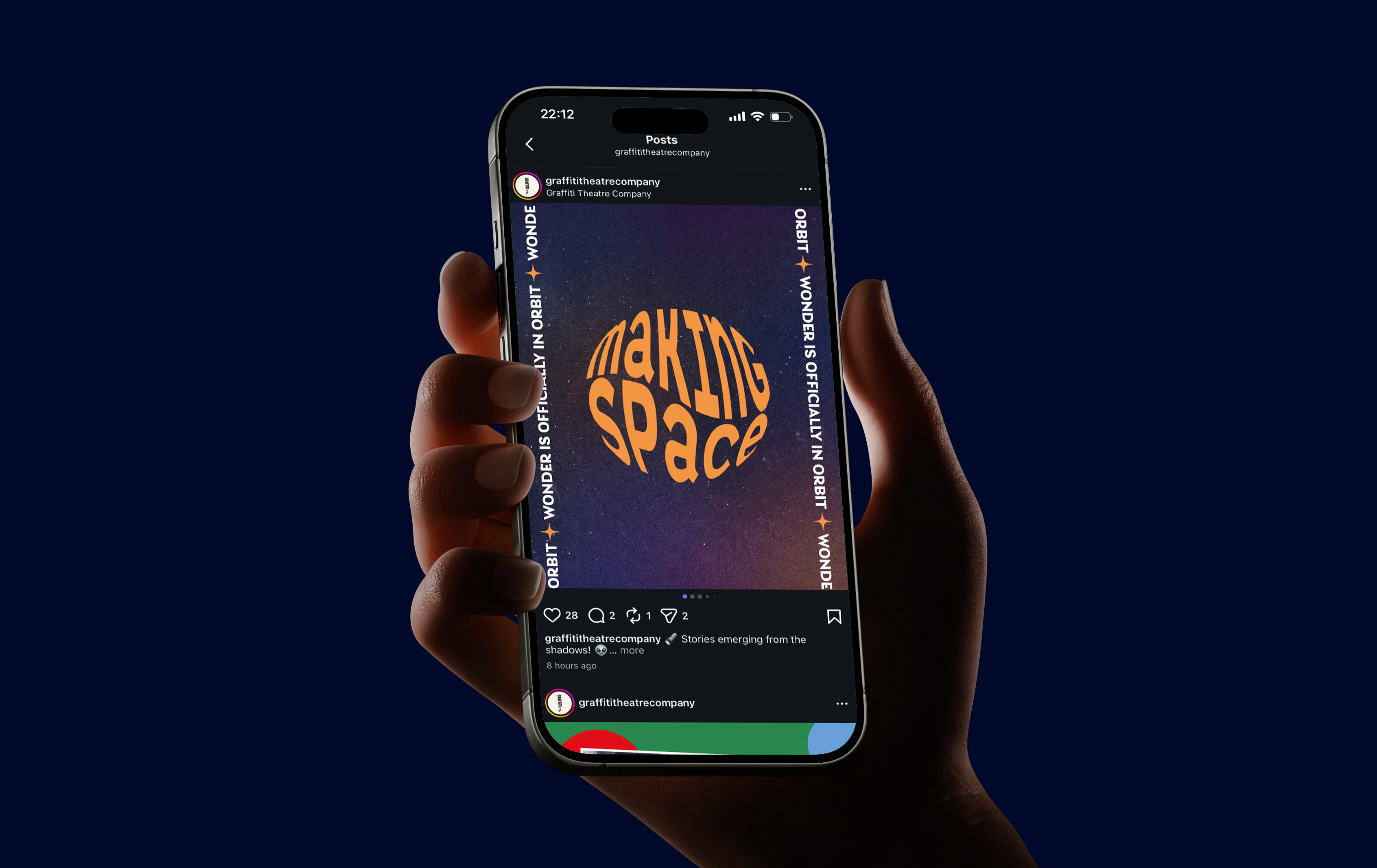
Commissioned by Cova Communications, I developed the brand identity for Making Space, a free arts and science education programme for primary school students in Cork, delivered by Graffiti Theatre Company in partnership with Blackrock Castle Observatory.
The identity was designed to capture the programme's spirit of creativity, curiosity and exploration, creating a visual language that would engage young audiences while reflecting the collaboration between arts and science. My role included designing the logo, developing the overall visual identity and look and feel, and creating an animated version of the logo for use across digital communications.
10
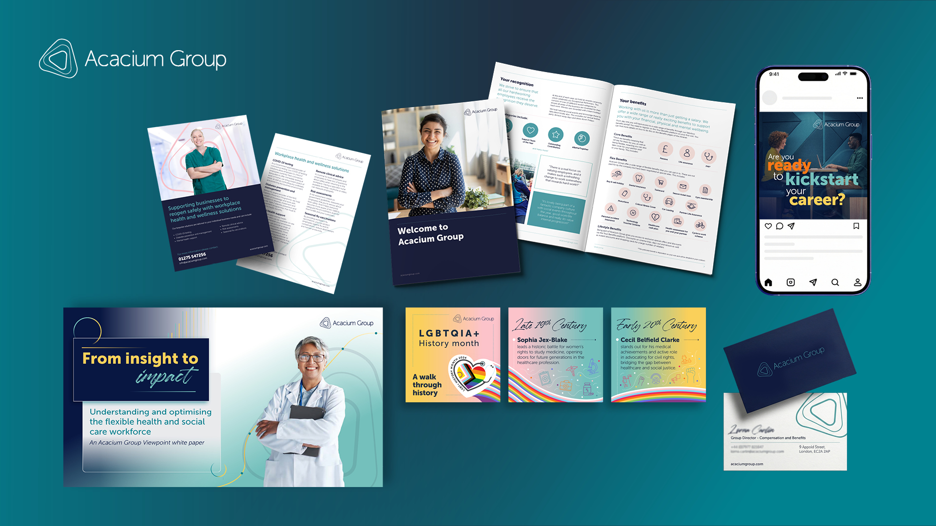
Acacium Group
I spent six years at Acacium Group, where I grew a small two-person design function into a high-performing internal agency supporting a global portfolio of 20+ brands. As Creative Director, I led all design activity across the group, building the team, setting standards and establishing systems that allowed creative work to scale across regions, services and audiences.
Building the Acacium Group brand with my team started with the creation and evolution of comprehensive brand guidelines, not only for the Group brand itself but for the wider portfolio of brands within it. It was essential to establish clear, structured systems that ensured consistency across all touchpoints while allowing each brand to retain its own identity. Accessibility was a priority throughout, rooted in WCAG principles to ensure colour contrast, typography, hierarchy and digital usage supported inclusive, user-centred communication across every market and platform.
11
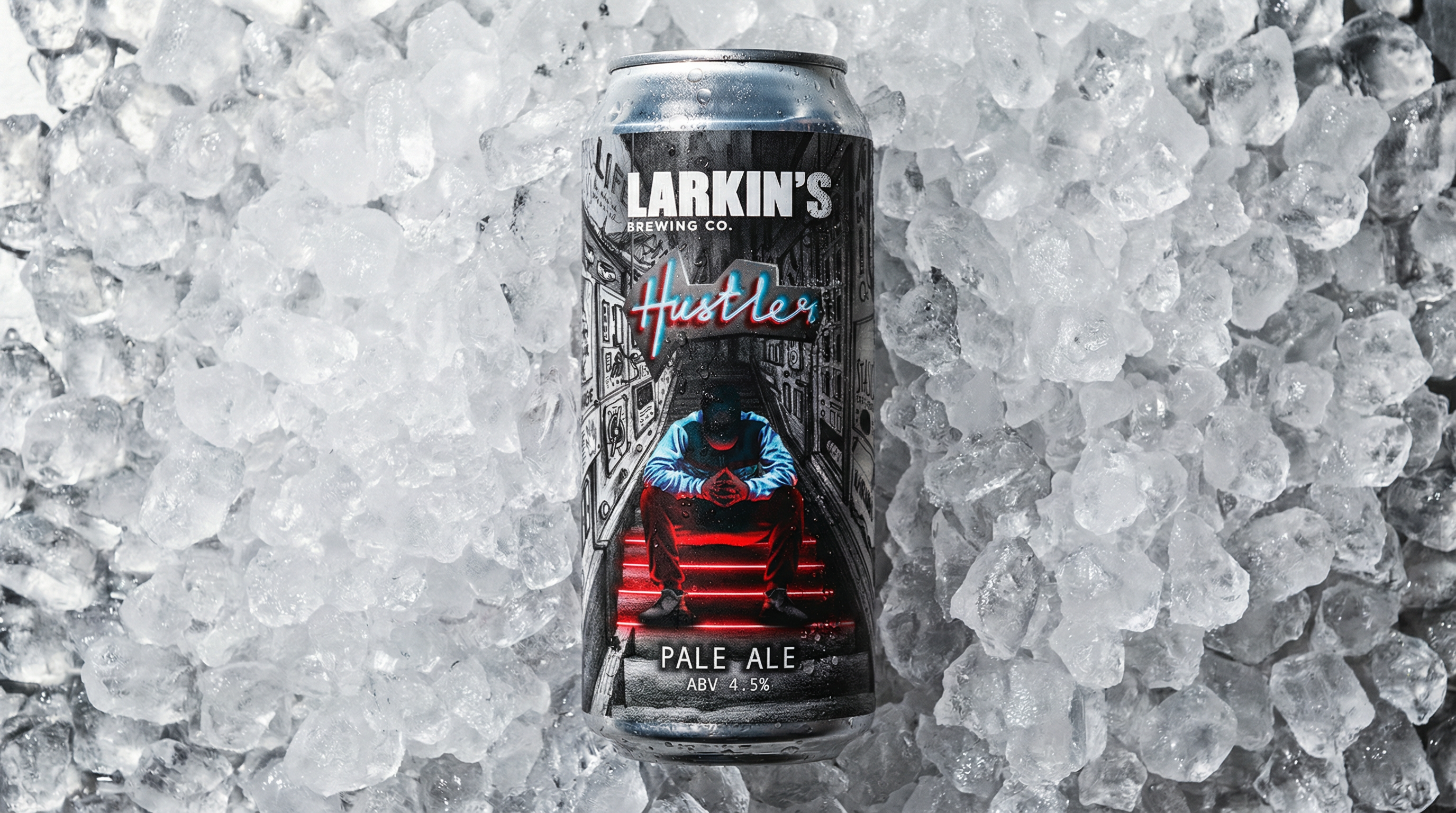
Hustler
For the Hustler Pale Ale project with Larkin's Brewing Co., I provided comprehensive art direction, concept development, illustration, hand lettering, and design to create a distinctive beer label. After presenting multiple personality concepts, Larkin's selected their preferred approach, which I refined into the final artwork, showcasing a tailored branding solution that aligns with their product’s identity.
12
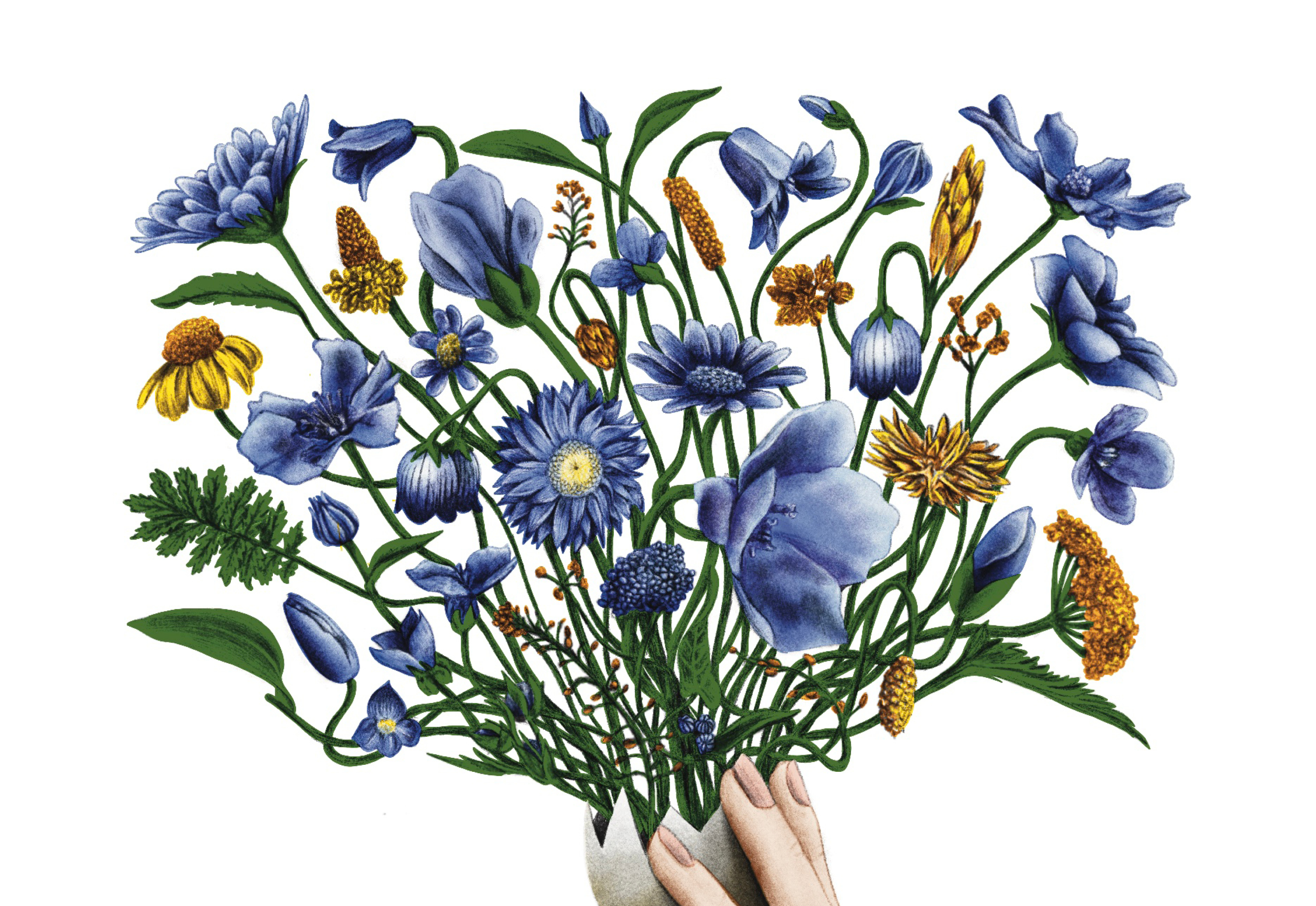
Crack Your Own Egg
Illustrations for 'Crack Your Own Egg', a collection of poetry by Laura Smalley.
13
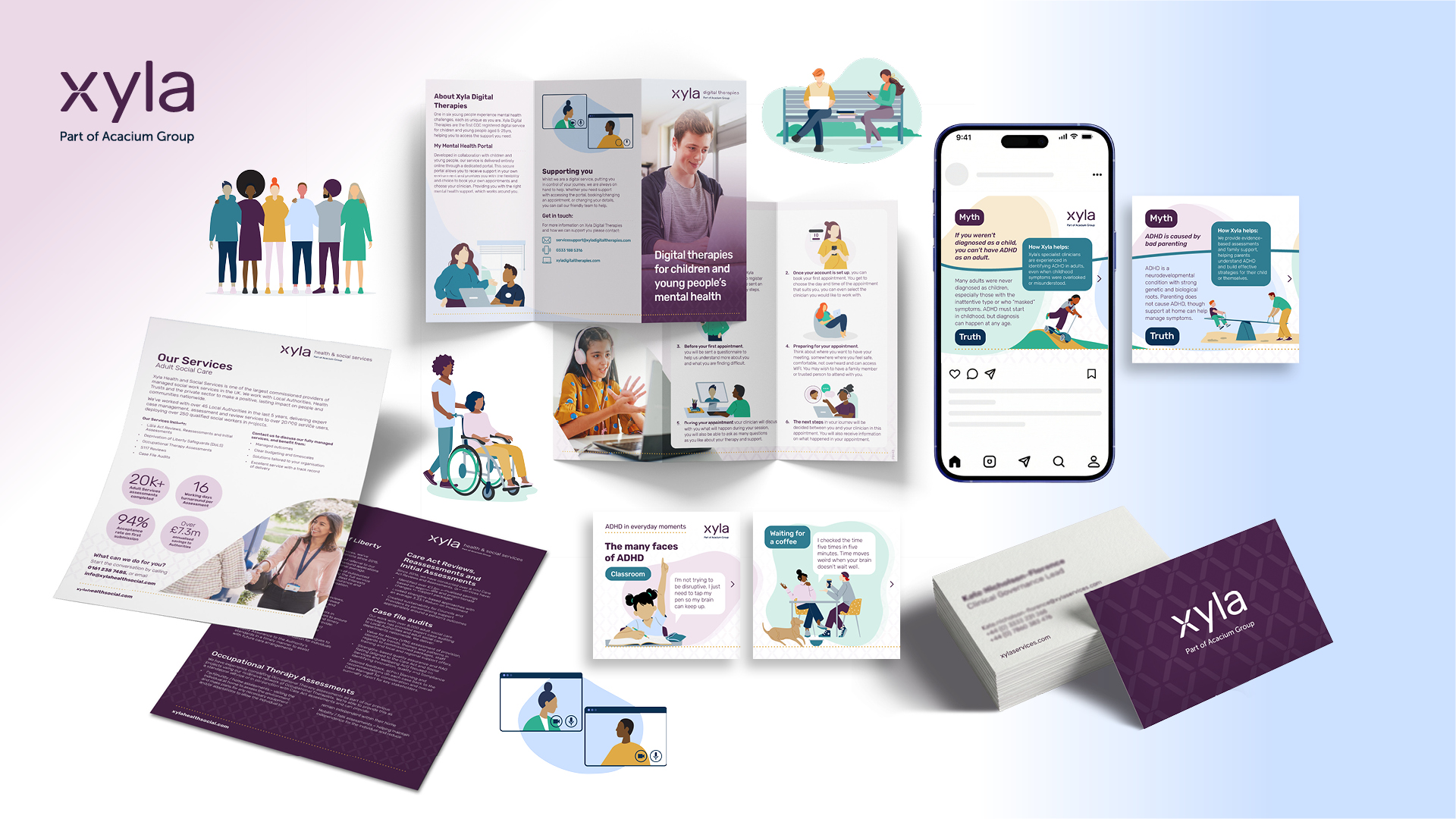
Xyla
As Creative Director at Acacium Group, I led the full rebrand of the organisation as it evolved from ICS to Acacium Group, overseeing all design activity across the business. This included the strategic development and rollout of the new brand across every touchpoint, creating a cohesive identity for a complex organisation delivering a wide range of healthcare services.
As part of this transformation, several ICS services were rebranded under Xyla, requiring the creation of a flexible brand ecosystem that could scale across multiple audiences and service areas. Over time, the brand evolved to better connect with service users, with illustration introduced as a core element to add warmth, personality and approachability. The system also includes a clear distinction between business-facing and service-user-facing communications, using a refined palette of navy, blues and greens for client/business audiences, and a more expressive palette of purples, pinks and yellows for service users.
This project page offers a snapshot of that evolving ecosystem, showcasing how the brand was designed to grow with the organisation. The rebrand has been highly successful, supporting strong business performance while creating a more accessible, human and engaging experience for those interacting with Xyla and its services.
14
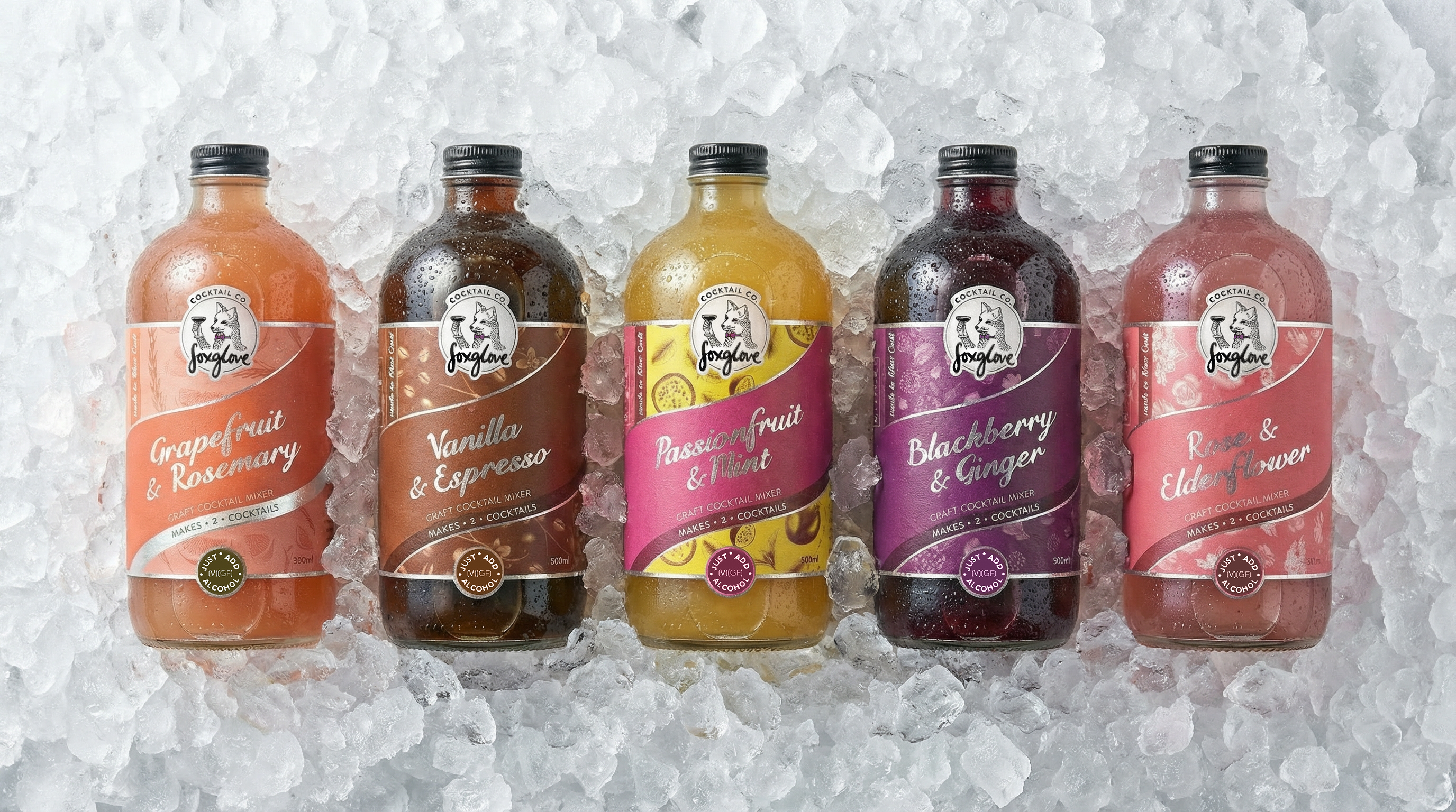
Foxglove Cocktail Co.
For Foxglove Cocktail Co., I created the branding from the ground up, designing a complete visual ecosystem that brings personality, craft and storytelling to the forefront. From the logo and core identity to bespoke illustrations, hand lettering and a custom typeface, every element was designed to feel distinctive, expressive and unmistakably Foxglove.
The brand extends across hand-drawn patterns that wrap the products, creating a rich, tactile presence on shelf, and a much-loved character that acts as the heart of the brand. Together, these elements form a cohesive, memorable world that customers connect with emotionally, helping Foxglove stand out in a crowded FMCG space and building a brand people recognise, remember and return to.
15
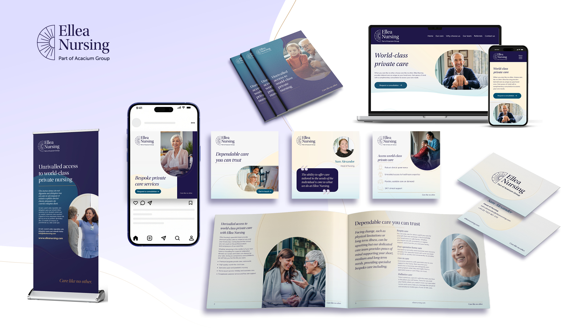
Ellea Nursing
As Head of Design at Acacium Group, I led a team of designers in the creation of the Ellea Nursing brand. With an experienced team of nurses and carers, Ellea Nursing delivers specialist care helping people manage their health in the comfort of their own home. Working closely with the marketing team and the client, we developed a clear understanding of the brief before carrying out in depth research and exploring a range of creative concepts.
The project was highly collaborative, with strong partnerships across UX, external developers, and copywriters to ensure the brand translated seamlessly across the website and wider touchpoints. Throughout the process, we worked closely with key stakeholders, sharing ideas, testing directions, and refining the brand through sketching, colour exploration, and typography development.
The result was a smooth, engaging, and highly successful branding journey, culminating in a confident new brand that is now live and very well received.
16
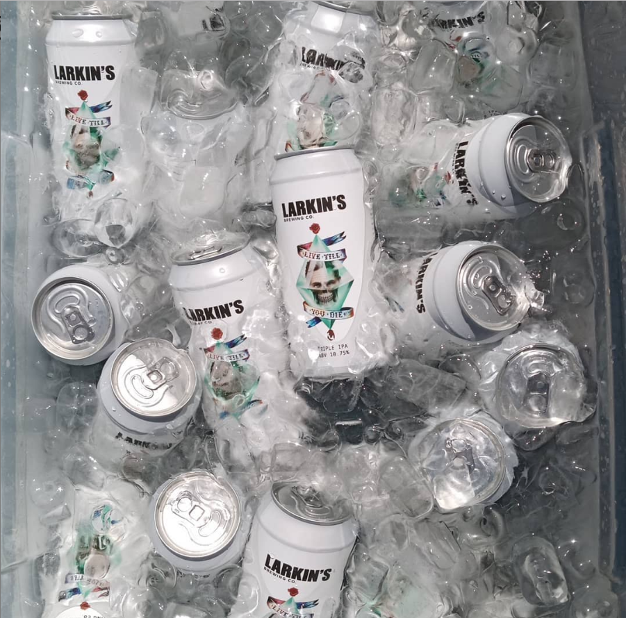
Larkin's Brewing Co.
For Larkin’s Brewing Co., I art directed and illustrated a suite of beer labels, each built around its own distinct character and story. Working from just the beer name, I led the creative process from initial sketches and mood boards through to the final hand-drawn artwork.
Alongside the labels, I extended the visual world across posters, beer mats, merchandise, van decal artwork, beer tap fisheyes, leaflets and fridge decals, ensuring each touchpoint felt cohesive and recognisably Larkin’s. Each label features bespoke illustration alongside custom typography and hand lettering, giving every beer its own personality while sitting confidently within a unified brand system.
Each label features bespoke illustration alongside custom typography and hand lettering, designed to give every beer its own personality while still sitting cohesively within the wider range. The result is a collection of labels that feel expressive, memorable and unique.
17
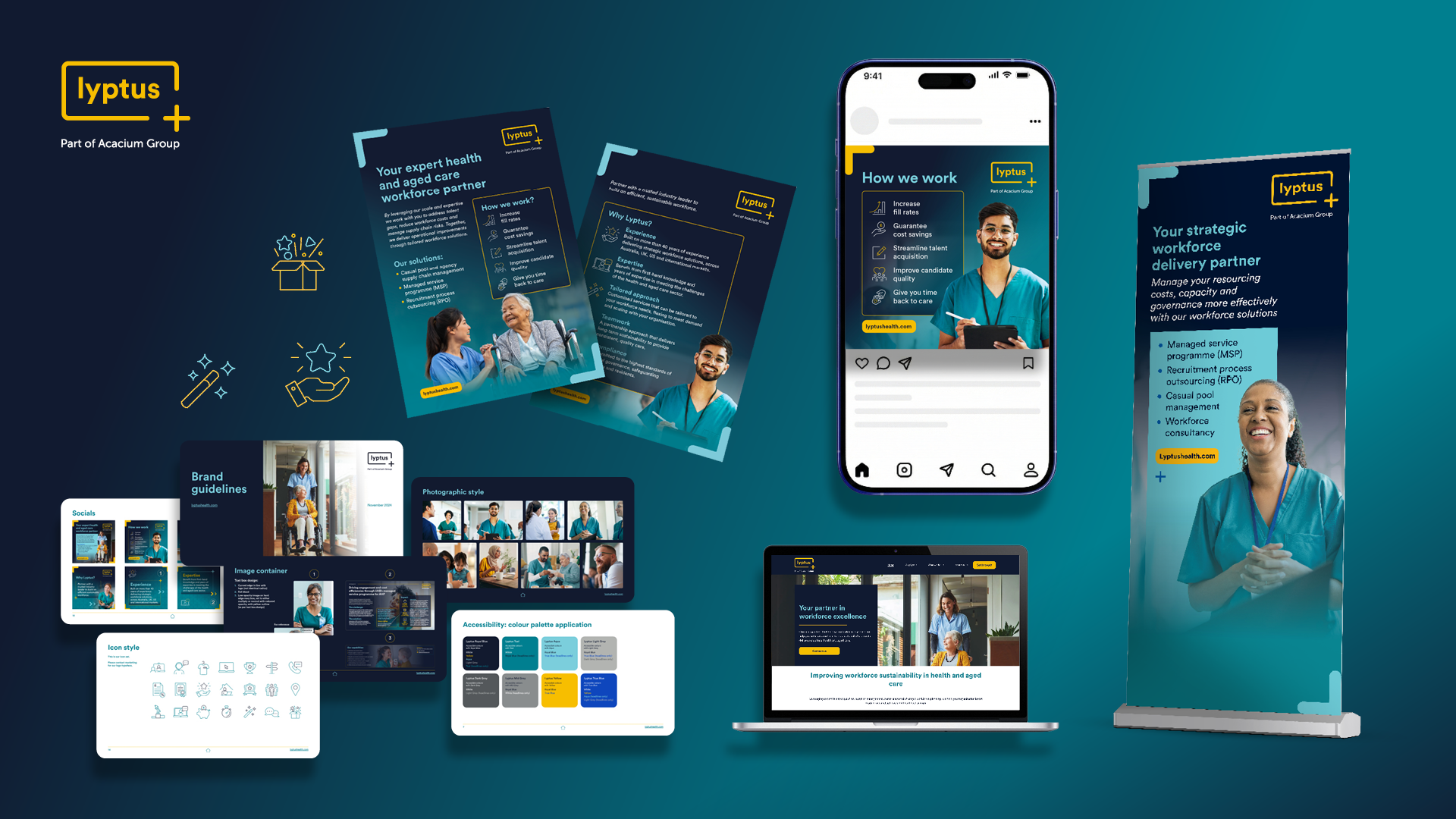
Lyptus
While leading the design team at Acacium Group, I oversaw the refresh of Maxxima, one of the Group’s established healthcare staffing and MSP brands. The updated identity was so well received internally that it became the foundation for a new international expansion of the business.
As the Group extended its services into Australia, the evolved brand was adapted and launched as Lyptus. Building on the strength of the Maxxima refresh, we carefully refined the visual identity to suit a new market while retaining consistency, accessibility and creativity. This project demonstrates how a strong, considered brand system can scale internationally, supporting growth while remaining rooted in healthcare credibility and design integrity.
18
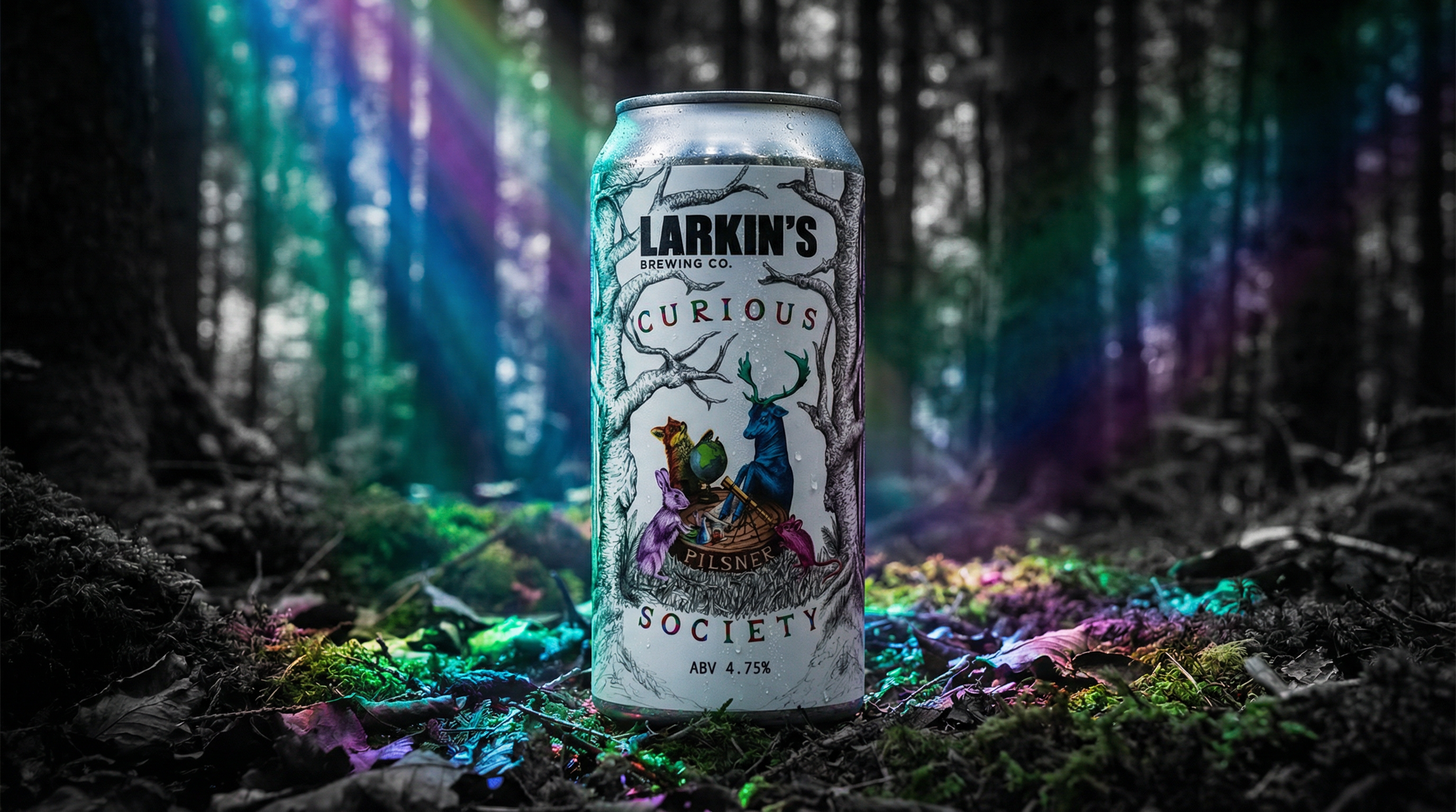
Curious Society
For the Curious Society project, Larkin's Brewing Co. commissioned me to develop a distinctive label for their Pilsner, where I led the art direction, concept development, design, illustration, and hand lettering. After presenting multiple personality concepts, Larkin's selected their preferred direction, enabling me to craft the final artwork that embodies the beer’s unique character.
19
Espirita
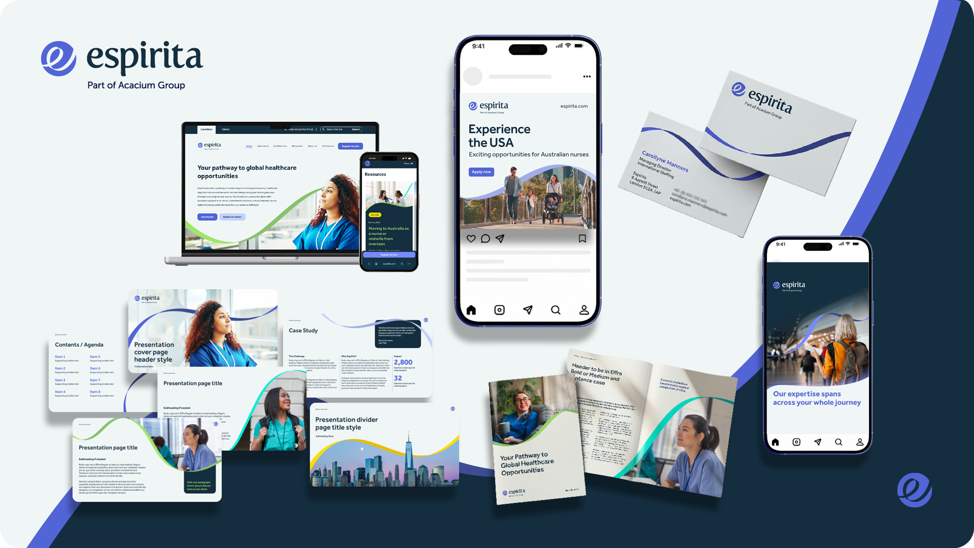
While Head of Design at Acacium Group, I led the rebrand of Espirita, an international healthcare recruitment agency connecting people with rewarding roles around the world. The business needed a refreshed identity that better reflected its global reach, expertise and the sense of opportunity at the heart of the brand.
Working closely with the business owner, internal marketing and business development teams, I helped define the spirit and personality of the new Espirita. I creative directed the rebrand in partnership with an external agency, guiding the visual direction, colour palette and typography to ensure the identity felt distinctive, credible and aligned with the wider group.
Once the new branding was approved, I project managed the full rollout. From our London studio, my team and I rebranded the entire Espirita collateral portfolio, collaborating with UX and global teams across the UK, US and Australia. This included the launch of a new website, social and email campaigns, and key business development materials such as pitch decks, banner stands, business cards and flyers, ensuring the brand was implemented consistently and effectively across all touchpoints.
20
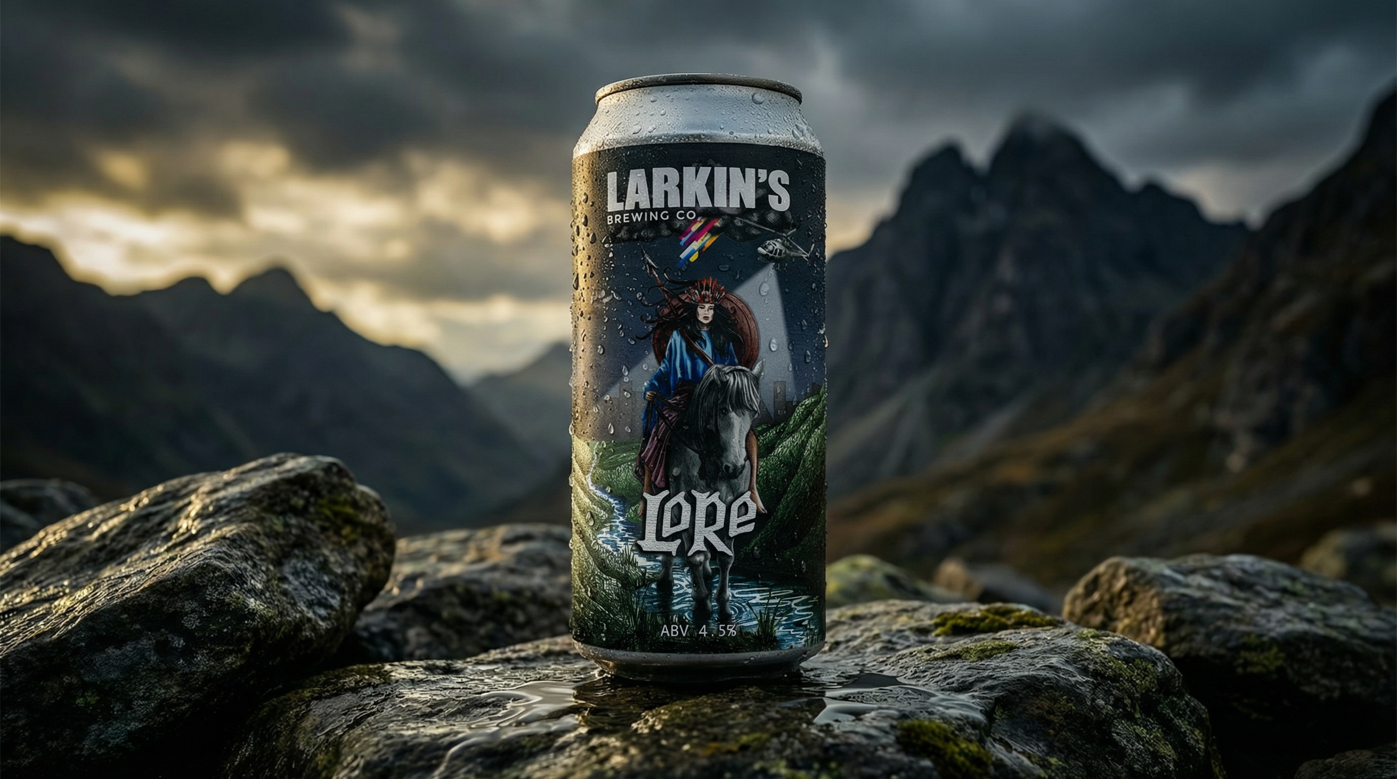
Lore
For this project Larkin's Brewing Co. asked me to create a label for a Pale Ale called 'Lore'. I conceptualised solutions and personalities for this beer. Larkin's then chose their desired personality for the product and I created the final artwork.
Next
01 / 20
Close
Previous
Next
Royal Ballet
Royal Ballet: Impressionist Swan Lake Animation
Animation and flip book artwork creation for the Royal Ballet
Go to link
01
Royal Ballet
Royal Ballet: Impressionist Swan Lake Animation
Animation and flip book artwork creation for the Royal Ballet
02
You Food Co.
A successful meal prep company approached idX with plans to expand from its established online business into a network of physical retail stores. I was involved from the early strategic stages, researching the market, developing naming options and exploring creative routes to establish a new brand identity for the business.
The project grew into a complete brand and environmental design programme. I developed the visual identity and then translated it into the physical retail experience, considering how customers would move through and interact with the space. This included developing the store narrative, wayfinding and signage, alongside packaging, POS, marketing materials, posters, environmental graphics and bespoke illustration.
The result was a cohesive brand experience designed to work seamlessly across digital, physical and customer-facing touchpoints.
03
Jos. A. Bank Store Rollout
I designed a suite of bespoke wallcovering and rug designs for Jos. A. Bank, taking the project from pattern and map artwork through material research, production and installation. I project managed the complex printing process across three idX divisions, overseeing the development and delivery of the final materials for a rollout across more than 300 stores throughout the US. The project generated over $2 million in revenue for idX.
04
Pitch Decks for Global Clients
A selection of pitch decks created for global clients including L'Oréal, Shell, Samsung and Under Armour while at idX Corporation. I developed the storytelling, structure and visual design, creating compelling presentations that communicated idX's capabilities and brought proposed retail concepts to life.
0:00
/
0:00
05
AQLÜM Lighting
I developed the brand identity for AQLÜM Lighting from the ground up, including naming, logo design and the wider visual identity. I also designed a suite of brochures to showcase the company’s lighting products, creating a refined and cohesive brand presence across print and marketing materials.
06
Freda Gin
I created the brand identity and packaging for FREDA, developing a bold and playful visual language for this contemporary pink gin brand. The identity combines expressive typography, vibrant colour and distinctive graphic forms across the bottle, stationery and digital touchpoints, creating a cohesive and memorable brand presence.
07
Jameson
'That's Pretty Neat'
Commissioned by Jameson, I developed the creative concept, copy and artwork for promotional materials celebrating Fadó Irish Pub’s 20th anniversary. The illustrated design brought together Jameson and Fadó’s visual identities with playful, celebratory messaging, creating a distinctive piece for the anniversary campaign.
08
Museums by Icon
Following my work with Icon Design on their retail fixture design website and wider brand materials, I was approached to help shape a new venture focused specifically on museum and exhibition environment design. Through a series of consultancy workshops and strategic conversations, we defined the positioning and ultimately landed on the name Museums by Icon, a natural extension of the parent brand, with its own distinct presence.
Building on Icon’s existing logo, I was tasked with elevating and refining it to suit this new cultural and experiential space. From there, I developed a considered brand system, including colour palettes, typography and a suite of print and digital collateral that balanced heritage, refinement and impactful design. I also designed and built the website, creating a platform that showcases their specialist expertise with confidence. The result is a cohesive, elevated brand that has been extremely well received.
09
Making Space
Commissioned by Cova Communications, I developed the brand identity for Making Space, a free arts and science education programme for primary school students in Cork, delivered by Graffiti Theatre Company in partnership with Blackrock Castle Observatory.
The identity was designed to capture the programme's spirit of creativity, curiosity and exploration, creating a visual language that would engage young audiences while reflecting the collaboration between arts and science. My role included designing the logo, developing the overall visual identity and look and feel, and creating an animated version of the logo for use across digital communications.
10
Acacium Group
I spent six years at Acacium Group, where I grew a small two-person design function into a high-performing internal agency supporting a global portfolio of 20+ brands. As Creative Director, I led all design activity across the group, building the team, setting standards and establishing systems that allowed creative work to scale across regions, services and audiences.
Building the Acacium Group brand with my team started with the creation and evolution of comprehensive brand guidelines, not only for the Group brand itself but for the wider portfolio of brands within it. It was essential to establish clear, structured systems that ensured consistency across all touchpoints while allowing each brand to retain its own identity. Accessibility was a priority throughout, rooted in WCAG principles to ensure colour contrast, typography, hierarchy and digital usage supported inclusive, user-centred communication across every market and platform.
11
Hustler
For the Hustler Pale Ale project with Larkin's Brewing Co., I provided comprehensive art direction, concept development, illustration, hand lettering, and design to create a distinctive beer label. After presenting multiple personality concepts, Larkin's selected their preferred approach, which I refined into the final artwork, showcasing a tailored branding solution that aligns with their product’s identity.
12
Crack Your Own Egg
Illustrations for 'Crack Your Own Egg', a collection of poetry by Laura Smalley.
13
Xyla
As Creative Director at Acacium Group, I led the full rebrand of the organisation as it evolved from ICS to Acacium Group, overseeing all design activity across the business. This included the strategic development and rollout of the new brand across every touchpoint, creating a cohesive identity for a complex organisation delivering a wide range of healthcare services.
As part of this transformation, several ICS services were rebranded under Xyla, requiring the creation of a flexible brand ecosystem that could scale across multiple audiences and service areas. Over time, the brand evolved to better connect with service users, with illustration introduced as a core element to add warmth, personality and approachability. The system also includes a clear distinction between business-facing and service-user-facing communications, using a refined palette of navy, blues and greens for client/business audiences, and a more expressive palette of purples, pinks and yellows for service users.
This project page offers a snapshot of that evolving ecosystem, showcasing how the brand was designed to grow with the organisation. The rebrand has been highly successful, supporting strong business performance while creating a more accessible, human and engaging experience for those interacting with Xyla and its services.
14
Foxglove Cocktail Co.
For Foxglove Cocktail Co., I created the branding from the ground up, designing a complete visual ecosystem that brings personality, craft and storytelling to the forefront. From the logo and core identity to bespoke illustrations, hand lettering and a custom typeface, every element was designed to feel distinctive, expressive and unmistakably Foxglove.
The brand extends across hand-drawn patterns that wrap the products, creating a rich, tactile presence on shelf, and a much-loved character that acts as the heart of the brand. Together, these elements form a cohesive, memorable world that customers connect with emotionally, helping Foxglove stand out in a crowded FMCG space and building a brand people recognise, remember and return to.
15
Ellea Nursing
As Head of Design at Acacium Group, I led a team of designers in the creation of the Ellea Nursing brand. With an experienced team of nurses and carers, Ellea Nursing delivers specialist care helping people manage their health in the comfort of their own home. Working closely with the marketing team and the client, we developed a clear understanding of the brief before carrying out in depth research and exploring a range of creative concepts.
The project was highly collaborative, with strong partnerships across UX, external developers, and copywriters to ensure the brand translated seamlessly across the website and wider touchpoints. Throughout the process, we worked closely with key stakeholders, sharing ideas, testing directions, and refining the brand through sketching, colour exploration, and typography development.
The result was a smooth, engaging, and highly successful branding journey, culminating in a confident new brand that is now live and very well received.
16
Larkin's Brewing Co.
For Larkin’s Brewing Co., I art directed and illustrated a suite of beer labels, each built around its own distinct character and story. Working from just the beer name, I led the creative process from initial sketches and mood boards through to the final hand-drawn artwork.
Alongside the labels, I extended the visual world across posters, beer mats, merchandise, van decal artwork, beer tap fisheyes, leaflets and fridge decals, ensuring each touchpoint felt cohesive and recognisably Larkin’s. Each label features bespoke illustration alongside custom typography and hand lettering, giving every beer its own personality while sitting confidently within a unified brand system.
Each label features bespoke illustration alongside custom typography and hand lettering, designed to give every beer its own personality while still sitting cohesively within the wider range. The result is a collection of labels that feel expressive, memorable and unique.
17
Lyptus
While leading the design team at Acacium Group, I oversaw the refresh of Maxxima, one of the Group’s established healthcare staffing and MSP brands. The updated identity was so well received internally that it became the foundation for a new international expansion of the business.
As the Group extended its services into Australia, the evolved brand was adapted and launched as Lyptus. Building on the strength of the Maxxima refresh, we carefully refined the visual identity to suit a new market while retaining consistency, accessibility and creativity. This project demonstrates how a strong, considered brand system can scale internationally, supporting growth while remaining rooted in healthcare credibility and design integrity.
18
Curious Society
For the Curious Society project, Larkin's Brewing Co. commissioned me to develop a distinctive label for their Pilsner, where I led the art direction, concept development, design, illustration, and hand lettering. After presenting multiple personality concepts, Larkin's selected their preferred direction, enabling me to craft the final artwork that embodies the beer’s unique character.
19
Espirita
While Head of Design at Acacium Group, I led the rebrand of Espirita, an international healthcare recruitment agency connecting people with rewarding roles around the world. The business needed a refreshed identity that better reflected its global reach, expertise and the sense of opportunity at the heart of the brand.
Working closely with the business owner, internal marketing and business development teams, I helped define the spirit and personality of the new Espirita. I creative directed the rebrand in partnership with an external agency, guiding the visual direction, colour palette and typography to ensure the identity felt distinctive, credible and aligned with the wider group.
Once the new branding was approved, I project managed the full rollout. From our London studio, my team and I rebranded the entire Espirita collateral portfolio, collaborating with UX and global teams across the UK, US and Australia. This included the launch of a new website, social and email campaigns, and key business development materials such as pitch decks, banner stands, business cards and flyers, ensuring the brand was implemented consistently and effectively across all touchpoints.
20
Lore
For this project Larkin's Brewing Co. asked me to create a label for a Pale Ale called 'Lore'. I conceptualised solutions and personalities for this beer. Larkin's then chose their desired personality for the product and I created the final artwork.
Royal Ballet
You Food Co.
Jos. A. Bank Store Rollout
Pitch Decks for Global Clients
Freda Gin
Jameson
Museums by Icon
Making Space
Acacium Group
Hustler
Crack Your Own Egg
Xyla
Foxglove Cocktail Co.
Ellea Nursing
Larkin's Brewing Co.
Lyptus
Curious Society
Espirita
Lore
bottom of page