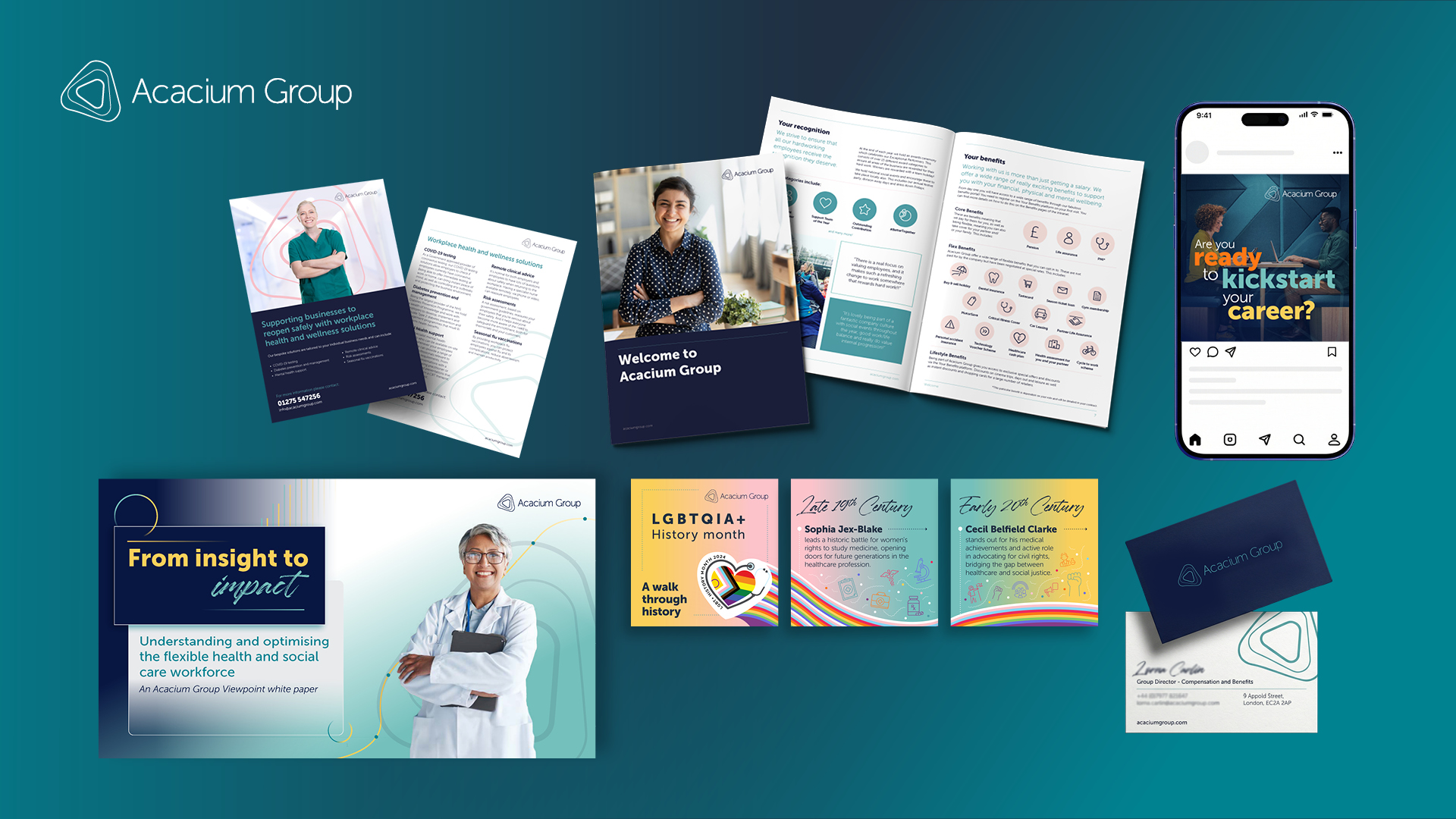
As Creative Director at Acacium Group, I led the full rebrand of the organisation as it evolved from ICS to Acacium Group, overseeing all design activity across the business. This included the strategic development and rollout of the new brand across every touchpoint, creating a cohesive identity for a complex organisation delivering a wide range of healthcare services.
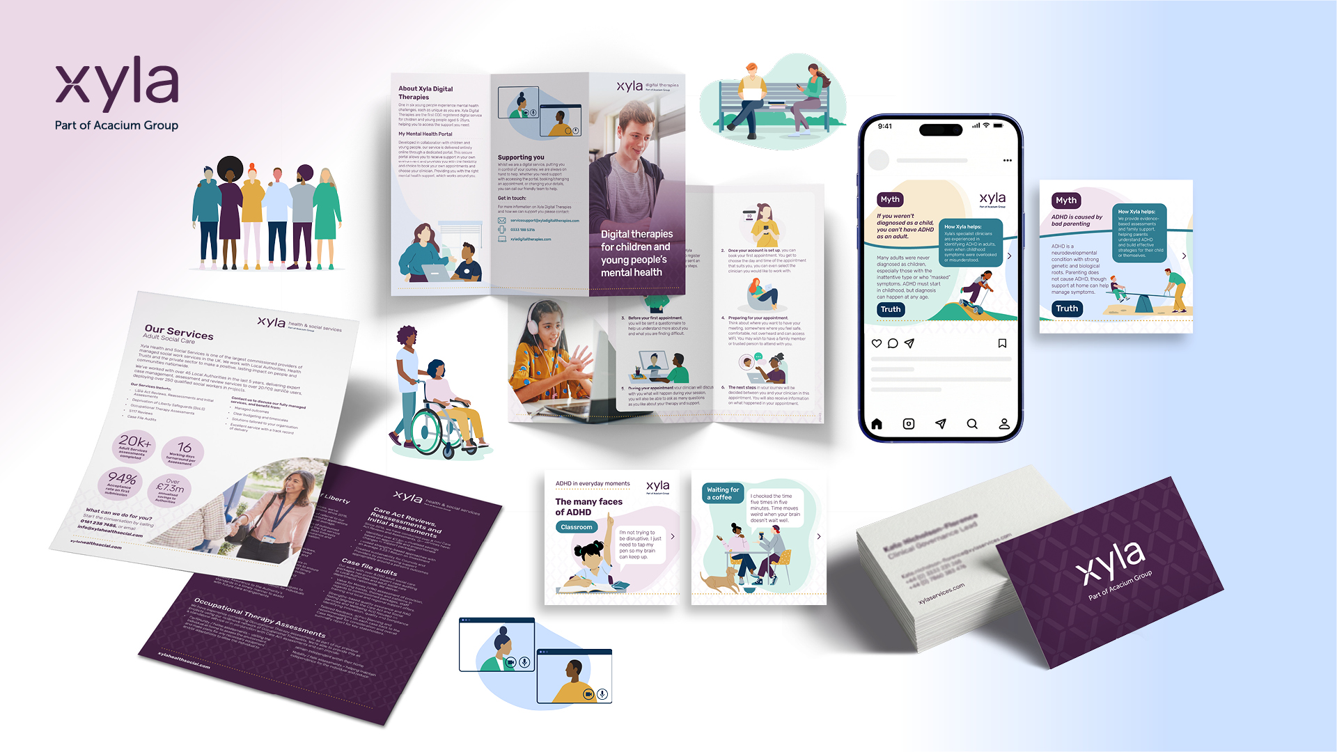
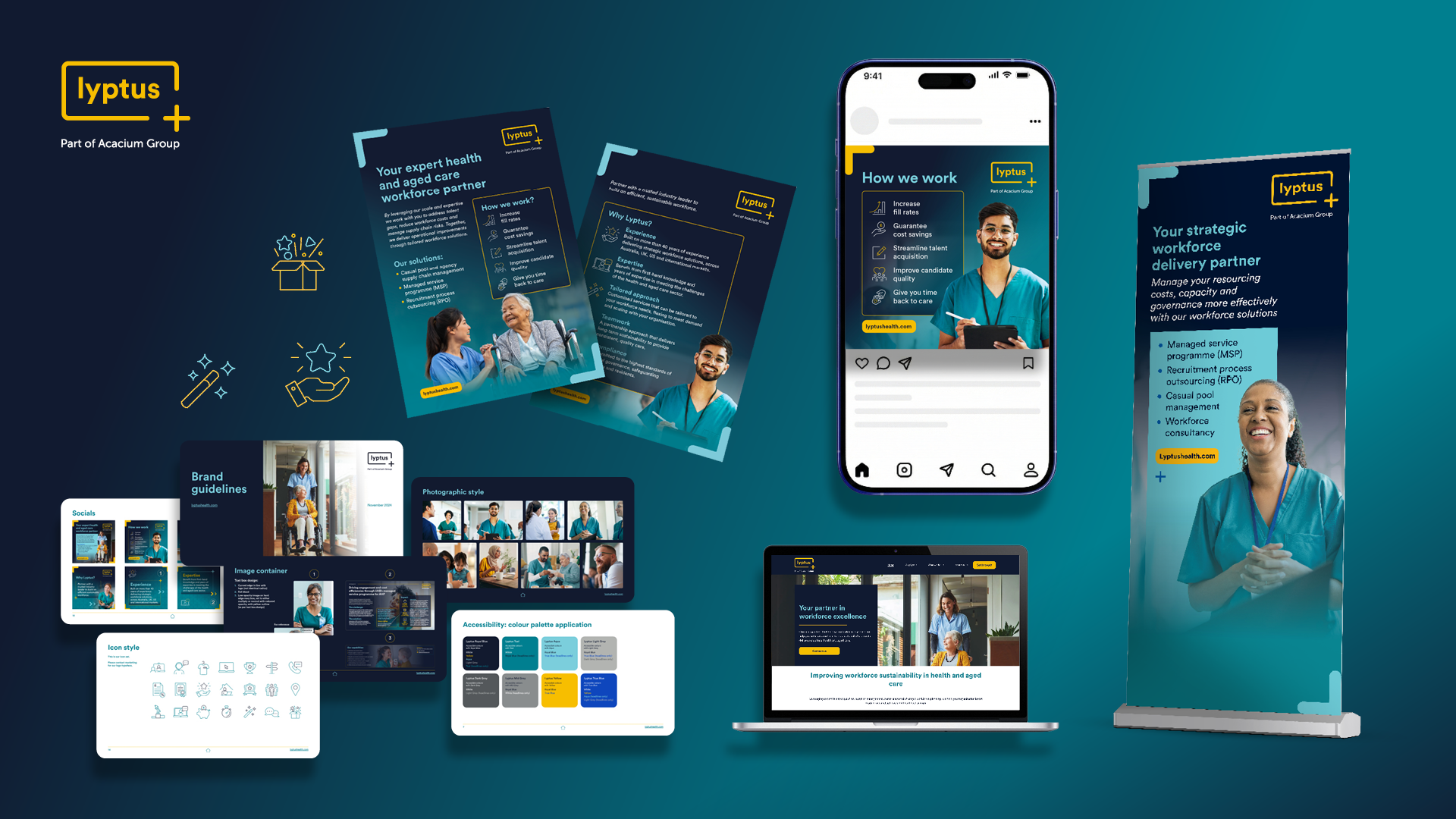
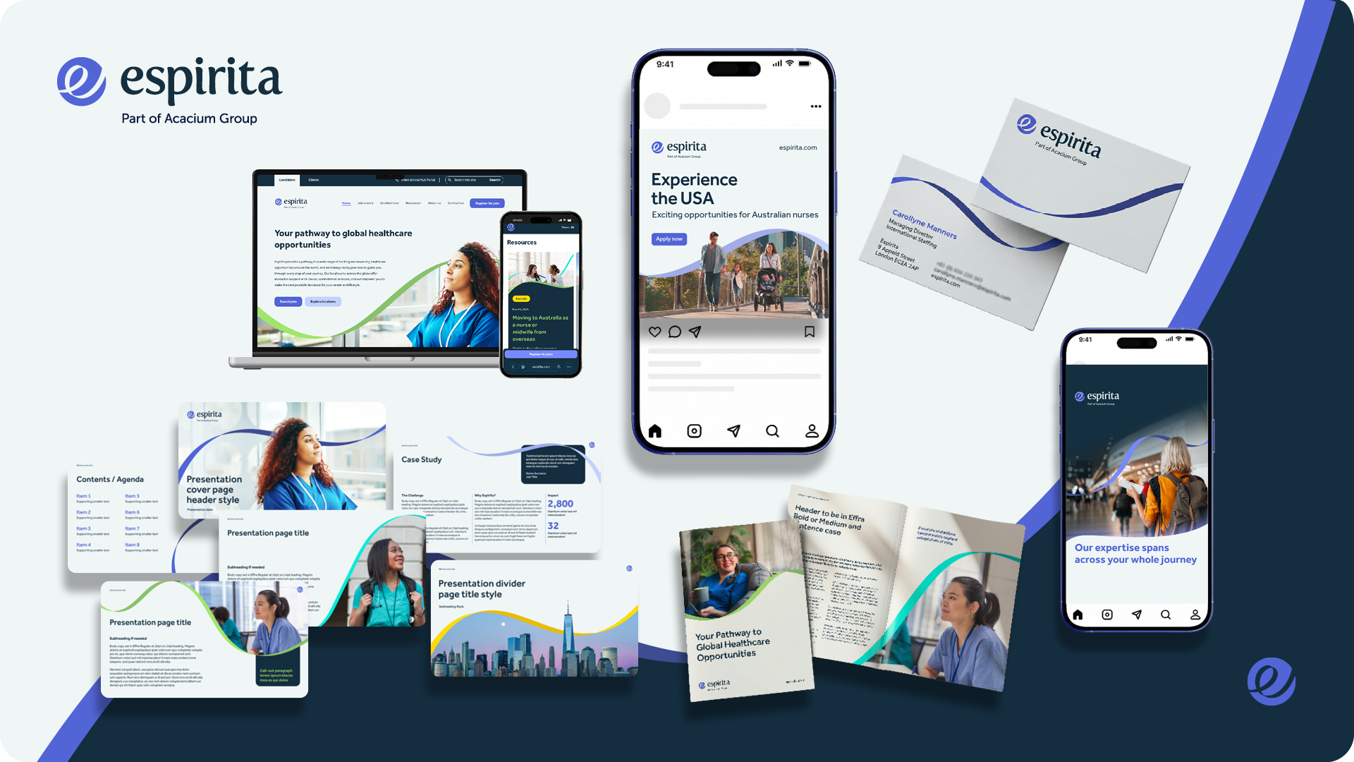
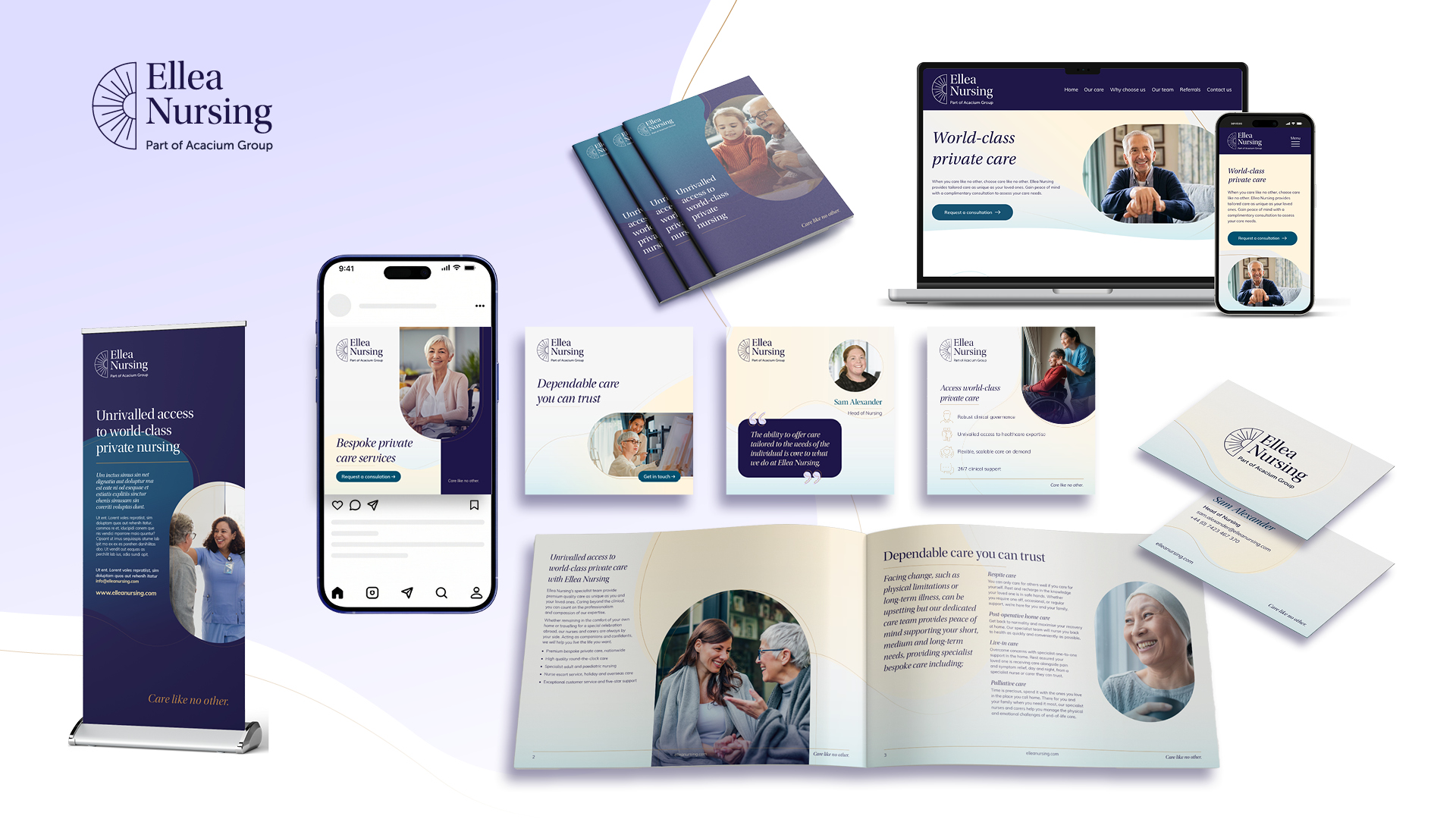
As part of this transformation, several ICS services were rebranded under Xyla, requiring the creation of a flexible brand ecosystem that could scale across multiple audiences and service areas. Over time, the brand evolved to better connect with service users, with illustration introduced as a core element to add warmth, personality and approachability. The system also includes a clear distinction between business-facing and service-user-facing communications, using a refined palette of navy, blues and greens for client/business audiences, and a more expressive palette of purples, pinks and yellows for service users.
This project page offers a snapshot of that evolving ecosystem, showcasing how the brand was designed to grow with the organisation. The rebrand has been highly successful, supporting strong business performance while creating a more accessible, human and engaging experience for those interacting with Xyla and its services.